Version:
3.1.0
Size:289KB
Downloads:37560
Last Updated:2012-01-25 04:45:17
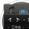
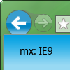
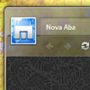
Screenshots
prev
next
Release note
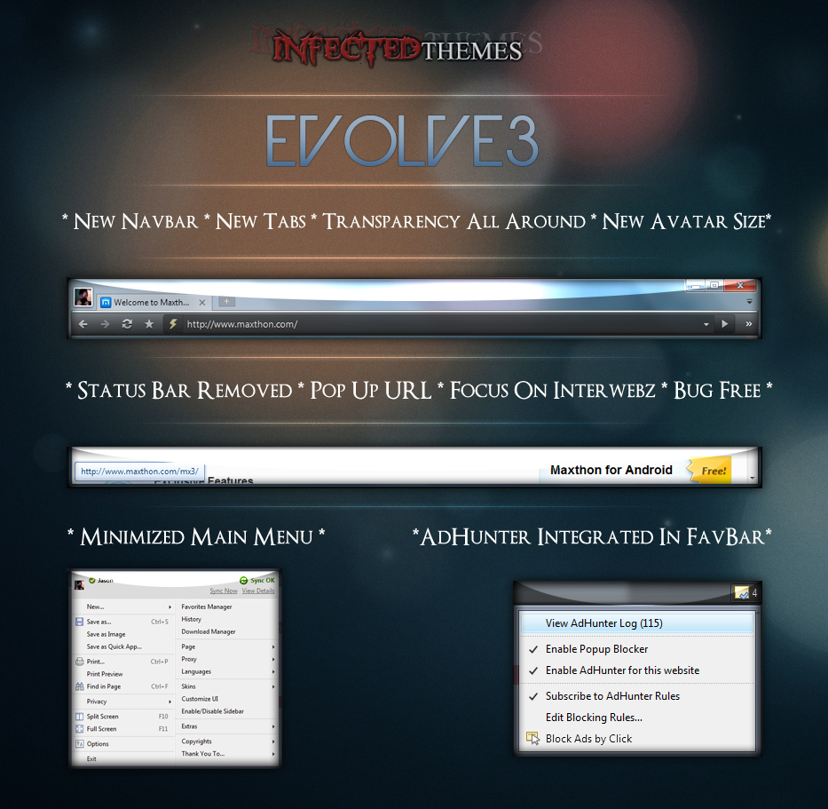
CHANGELOG:
FINAL 3.0
- Fixed Spelling Error.
- Added AdHunter to NavBar (Fully Functional!!!)
- Cleaned Up Extra Coding.
- Fixed Minor Bugs In Design.

BETA 2.5
UPDATE THREEPOINTFIVE
- Fixed Split Tab Image
- Reduced Gap In Tab Area/Edge of Window.
- Moved Avatar Image Appropriately To Be More 'EVEN'

- Main Menu has been minimized.
- Bugs squashed.
- Color Changes To Certain Menus

BETA 2
- After careful consideration, I am going forward with this being a Sidebar-less theme. Sidebar should be hidden for most optimal view of this theme.
- Status Bar removed.
- Floating Status Text added.
- Squashed some bugs!
- Minor Edits to code.

BETA 1
- Removed massive margin width in navbar when SideBar is not shown.
- Fixed Avatar sizes for both Sidebar ON and Sidebar OFF.
- Fixed margins between avatar and tabs.
- Decreased max-tab size to allow for more tabs viewable.
- Reduced more clutter.
- A few graphical edits done as well, none that are noticeable.
- Removed AdHunter button in status bar, attempting to move to Quick Tools menu still.

Alpha 1.X.5
- Sidebar has decreased in size.
- New Navigation buttons (some will be removed still)
- Navigation bar height decreased to keep screen real estate to a maximum for web pages.
- Tabs have been completely revamped!
- Nav Bar, URL bar, Status Bar are now semi-transparent.
- Dark colors all around.
- Fixed Avatar Size for when the Sidebar is up.
- Removed middle "tab history" button from Nav Menu.

THANK YOU TO...
A special thanks to the Maxthon Development team, to my new friends (the Ambassadors), Barbara, ALL OF YOU, my family, and everyone else who supports me over the coming years as I design and develop more and more for Maxthon.
Reviews
Write your review-
This is very good!!! Could you put a bright color? For example chrome's color? And the avatar's square bigger? Because avatars are cool :)
-
当前标签非常不明显啊!
-
Слишком прозрачный! Спасибо за то, что эту строку снизу убрали (как в Firefox и Chrome) Но по мне, так вместо прозрачности лучше бы смотрелся какой-нибудь спокойный цвет...
-
我还是比较习惯底部的状态栏
-
很漂亮,就是非活动标签的文字颜色有点看不清